

Upgrade to Postpaid,
with confidence.
Helping prepaid customers understand postpaid, choose the right plan, and make a switch they want to keep.
I led Mobility design across the upgrade journey and postpaid discovery page, combining continuous experimentation with clearer education and more relevant plan choices.
my role
Lead Product Designer
SCOPE
Discovery → conversion
→ early ownership
team
Product, Growth, Research,
Content, Analytics & Engineering

Overview
Business & Challenges
Airtel is a one of the largest telco provider in India that helps customers with connectivity & entertainment.
Shifting users from Prepaid to Postpaid boosts average revenue per user ARPU and long-term contribution and retention to deepen customer relationships. It enables cross-sell/upsell through bundled services, and drives cost efficiency by reducing recharge frequency and support load.
upgrades happen in a day
~6-8 K daily on average
~150k
20%
Left within the 1st month
50%
defaulted, ported out, or slide back to Prepaid in 3 months.
01
Churn out of Airtel
Users move to other operator, if they face issues or don’t like the plan due to price & benefits.
02
Bad debt
Users with low number affinity, doesn’t pay the bill and just move ahead.
03
Stay back in Prepaid
Users who trust Airtel’s brand value, come back to as Prepaid users, with lack of trust.
Postpaid is a major growth opportunity for Airtel. But an upgrade only creates lasting value when
customers understand what they chose—and stay.
Help customers see the value, understand the commitment, and make an informed upgrade they want to keep.
Research & funnel analysis
Understanding what made the upgrade uncertain.
We combined conversion-funnel analysis with research involving 45+ users to understand how prepaid customers evaluated postpaid and where the journey created confusion.


The original conversion journey
User get’s to choose the best suitable plan
Confirmation of
successful activation
App Homescreen
Number is verified to fetch user’s details
User Information is being auto-filled + offers are fetched
Users verified their number and completed personal details before reviewing plans. Some believed they were requesting a callback. Others entered while trying to solve an immediate prepaid need, such as running out of data, and upgraded without understanding the switch.
01
The price comparison was incomplete.
Users compared postpaid with their main prepaid recharge, often overlooking the extra data packs and OTT subscriptions they paid for separately.
02
Benefits were difficult to value.
Included subscriptions, data rollover and other benefits appeared below key decision points. Users saw the monthly price before understanding what they received.
03
Prepaid felt like control.
Daily limits acted as a spending guardrail. Postpaid raised questions about bill shock, monthly allowances and what would change after upgrading.
Hover to see the funnel analysis and heuristic evaluation
Experimentation
Learning our way
through the funnel.
We ran a set of experiments across plan comprehension, education, form inputs and verification. The work culminated in an OTP-at-the-end journey with better activations than the original flow.
Experimentation 01
Make plan value easier to compare.
Around 50% of users dropped off at plan selection section. Research highlighted, due to cognitive overload, difficulty comparing plans and understanding the value of included benefits. Overall caused by poor information hierarchy.
There is no value reflected against the OTT benefits
User primarily focus
plan pricing and
the value of plans
Multiple Key value units to be highlighted
After all Price is the common segment to make decisions
Repetition of the selection
Plan name might not create a high value for user, thus doesn’t have to have main focal in the hierarchy

Explorations


Bestseller
The revised design
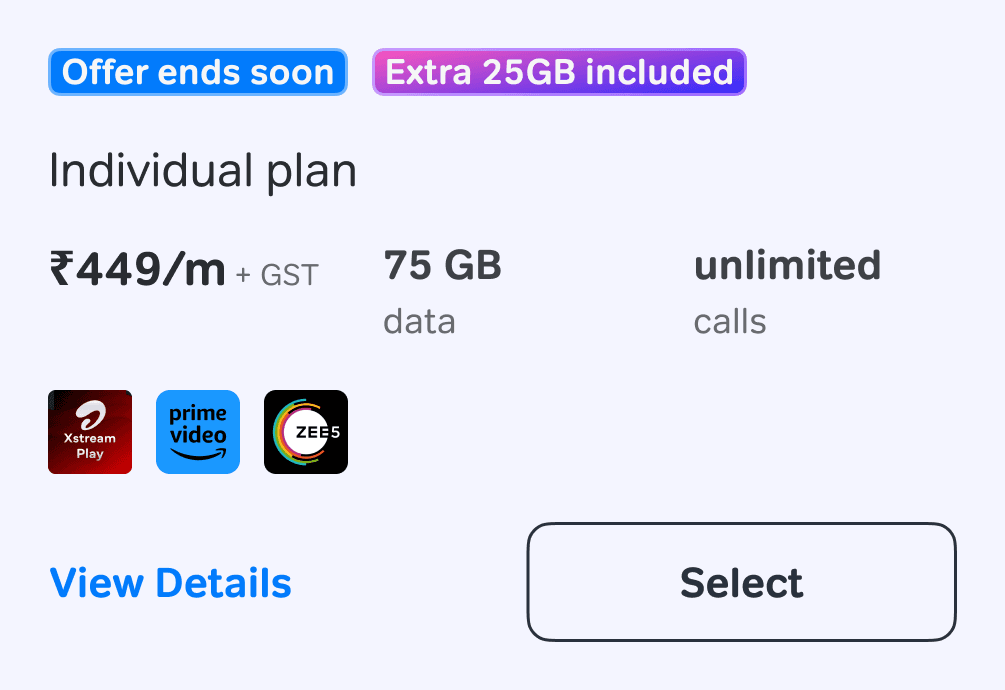
Helping users see what they’re paying for. I redesigned the plan cards around three questions: How much will I pay? What do I get? Does it fit my family? A clearer hierarchy brings price and benefits upfront, helping users compare plans and make an informed choice.
•
Give price, data and per-member value a clearer hierarchy.
•
Show the tangible value of included OTT benefits.
•
Distinguish individual and family plans, with filters for focused
exploration.
•
Keep more plans visible and use a peek of the next card.
•
Require an explicit selection so customers consciously choose a
plan.
Plan-page drop-off
50% → 42%
8% points lower
Activations
+1K
per day
6K to 7.2K
Scroll interaction
12%
small-scale Heatmap mapping
View details clicks
8%
Experimented with a 10% audience with a A/B testing for around 2 weeks with V2L’s as guardrail
Experimentation 02
Make the switch explicit before activation.
Completing the journey didn’t always mean customers understood they were switching to postpaid. After verification, they were only 1 tap away from activation.
We introduced a critical friction point at the final confirmation step. It explained instant activation, reassured customers that they could keep their SIM without additional KYC, and highlighted when they could switch back to prepaid.
•
Baby care program of onboarding these users(run on a few areas in country), showed us great increments in 25% less accidental conversions statements by the users.
•
Leading to a healthier postpaid portfolio and reducing support interventions.

Visit-to-activation
13%
V2L stood at 23% decreased to 20%
Same month Roll-back
65%
earlier it was 20% decreased to 7%
Quality Conversions
The trade-off was visible: fewer immediate conversions, with a healthier early-retention signal.
Experimentation 03
Move OTP from entry to final intent.
OTP works best as a final confirmation, not an entry barrier.
Early OTP feels like a commitment before users have had a chance to explore, compare, and truly understand what they’re opting into. We moved OTP to the end of the journey so users can first review plan details and then confirm with intent. Placing OTP at the final step also acts as a healthy friction —a deliberate pause that prevents accidental conversions and makes the upgrade feel more transparent and trustworthy.
The first test fell short.
V2A funnel
23% → 9.2%
Conversion quality improved, but absolute acquisition volume fell. Despite having larger outflow funnel flowing in.
The initial response
Scale down and keep learning.
We reduced exposure to that variant. The next rounds
addressed the effort surrounding verification as well as OTP placement.
Simplify the steps around verification, was the turning point
•
Remove an unnecessary input. We removed the alternate-number field to reduce form effort.
•
Prefill what was already available. We fetched and prefilled email details where available, reducing what users had to type.
•
Give email completion a clear purpose. Offer-led prompts and notifications gave users a reason to provide their email, helping
improve the fill rate.
Activation
16%
9.5K ~ activations
Month 4 churn
32%
earlier it was 50%
Quality Conversions
The trade-off was visible: fewer immediate conversions, with a healthier early-retention signal.
Through further rounds of experiments, the revised OTP-at-the-end journey outperformed OTP at the start on
visit-to-activation, business metrics leading to a 100% scale up.
A better journey.
Now, a better way in.
Next, we brought education ahead of the upgrade journey, helping customers understand postpaid and decide whether it was right for them.
Understanding Postpaid
New Entry Point
Explore benefits, see plans and get answers
Sell CLPs
Enter the upgrade journey
Choose → Details → Final OTP
Postpaid discovery
Education before the upgrade.
We created a Postpaid category landing page - Sell CLP, for customers who didn’t own the service.
It brought plan value, benefits, switching guidance and common questions into one experience. Customers could explore postpaid and decide whether it suited their needs before entering the upgrade journey.

Sell / Explore postpaid
For customers without postpaid: understand benefits, compare plans and get answers before switching.
Serve / Manage postpaid
For existing postpaid customers: manage their plan, track usage, pay bills and get support.
One Postpaid tab for discovery and management.
Category navigation on the revamped home screen, with the Postpaid destination tailored to service ownership.
Category Landing Pages
Turn campaign interest into understanding
Making browsing into confidence and trust building action. While helping users get the answer of why for you?
Fast Lane Technology, unlimited data and Advantage Club expanded the postpaid proposition. The CLP helped customers understand what these benefits meant for them, alongside plan costs and the practicalities of switching.
Design Details
One shared structure, configured around
customer needs.


Family First
Individual Led
Entertainment Led


Compare existing spend
Help customers compare their prepaid recharge and subscription spend with the cost of postpaid.
Explainer Content
Show the steps involved in setting up a family plan, reducing uncertainty before upgrading.
Quick View Comparison
Compare cost, data, payment model and family convenience so customers can assess the fit.
Beneficial for user
Surface contextual offers without competing with essential service actions.
Building reassurance
Explain what happens to prepaid validity and the existing SIM, alongside eligible joining benefits.
Add customer proof
Use genuine customer experiences to support the proposition.
Answering any kind of remaining questions
Address concerns about number continuity, data limits, charges and remaining prepaid validity.
FAQ with filters
Quick to scan and find what is required
Benefits grid
Make data, speed, one-bill convenience and entertainment benefits easy to scan.
Advantage Club/Exclusive offering
Make exclusive value concrete
Show the experiences available through Advantage Club as part of the wider postpaid proposition
Plan details
Everything about your plan, in one place
Per-member value, family size and one-bill convenience.
Anchor Story
The hero story that connects emotionally — highlighting why it’s right for you.
Decision Making
Capturing user’s attention on plans which is best/recommended for them, enabling quick decision.
Make family value comparable
Let customers choose their family size and see total cost, per-member pricing and included benefits together.
I organised the Sell CLP around the questions customers needed answered before upgrading: why consider postpaid, which plan fits, what value it offers and what changes after switching.
The modules shared a common structure, while their content, visibility, order and CTA destination could be configured for different customer contexts. Customers could get answers without starting a form first.
See the detailed template?
Same modules. A different order and emphasis.
Let customers continue when ready
Place upgrade entry points after key sections so customers can proceed once they have enough information.
Design Principles
Lead with a relevant reason to consider postpaid.
Make plan value easy to compare.
Resolve concerns before asking customers to upgrade.
Lead with relevance
Match the opening proposition to the customer’s interests, supported by key benefits and switching assurances.


Impact
Beyond the
first conversion.
Total Contribution
15%
of postpaid gross additions
now come through CLP.
V2Ls
For a user coming via CLP to journey vs directly to journey, the conversion was the same.
Family-plan adoption
5%
higher
vs the rest of the app
Same-month rollbacks
6%
lower
vs the rest of the app
Customer understanding
Reported feedback indicated a clearer understanding of postpaid and its included benefits.
Read conversion alongside retention.
We evaluated acquisition, family-plan adoption and early rollback together to understand whether customers were making upgrades they wanted to keep.
Sell when the moment
makes sense.
We extended postpaid discovery into recharge, introducing a relevant alternative while protecting the customer’s immediate prepaid need.
Prepaid Number
Recharges
Cross-sell Postpaid
Upgrade? Get unlimited data
Recharge cross-sell
Introducing postpaid within a familiar task.
There is close to 1.5 million recharges happening daily. Recharge was a familiar, often time-sensitive task. For customers managing multiple family numbers, it also offered a relevant moment to consider a postpaid family.
We introduced an optional proposition for relevant customers recharging early. Near expiry, continuing prepaid service remained the priority. The experience needed to make family-plan value understandable and the category switch explicit, while keeping prepaid recharge easy to complete.
This critical touchpoint remains under-utilised, with gaps in targeting, benefit communication, and a seamless upgrade experience, leading to missed conversion opportunities.


The RECHARGE journey
User chooses and confirms payment
Confirmation of
successful activation
App Homescreen
Rechargets relevant to number are fetched
User is highly likeable to upgrade to Postpaid when their recharge is expiring, Find high value user subset and curate exclusive plan for them.

Preserve the familiar recharge task.
Keep the experience quick and recognisable, with a clear way to continue recharging prepaid.
Make the category switch explicit.
Help customers understand that they are choosing postpaid, review the plan and commit deliberately before activation.
Recharge was a relevant place to introduce family postpaid—but protecting the customer’s
immediate prepaid need came first.
Design Details
Show the offer without losing the recharge.
For customers recharging early, particularly those managing multiple numbers, we explored an optional family-
plan proposition. Near expiry, the recharge task remained the priority so postpaid did not overpower service
continuity.
Time-critical recharge
Keep recharge primary.
Near-expiry users should be able to continue their prepaid service with minimal interruption.
Early recharge · relevant cohort
Offer a considered alternative.
Explain per-SIM value and family convenience, with a clear choice to continue recharging.


Introduce a relevant alternative
Clearly identify the postpaid family offer, with monthly pricing and included SIMs visible alongside the prepaid recharge options.
Support the decision
Keep billing details and prepaid comparisons available before switching, with a clear route back to recharge packs.
Make family value tangible
Show the total monthly cost, cost per SIM and included benefits so customers can evaluate the offer for their household.
Make family setup explicit
Retain the selected-plan summary while customers provide family connection
and billing details.
Make the recurring cost clear
Separate plan rental and GST so customers can understand the monthly amount before confirming.
Explain what happens next
Confirm the upgrade status, summarise benefits and guide customers towards linking or claiming their included family SIM.
Confirm the category change
Use OTP and an explicitly labelled upgrade action to confirm the switch, with the return-to-prepaid restriction visible.
Consideration Impact
From offer exploration to family adoption.
User’s exploring Postpaid
45%
clicked on the offering and got educated
Family Plan
10%
vs the rest of the app
Free Child SIM - Claim Ons
2%
vs the rest of the app
Measure beyond the offer click.
An effective cross-sell should lead to an informed upgrade and completed family setup. We therefore considered offer exploration, family-plan adoption and included-SIM claims as separate signals.
Reflections
Designing for lasting value
01
Stay with the problem. Keep adapting the solution.
The first OTP-at-the-end test missed the business target. Further experiments removed input effort, improved email
completion and eventually made it the better-converting default. Benchmarking gave us a hypothesis; sustained
iteration made it work.
02
Relevance changes the value equation.
A family decision-maker, a heavy data user and an entertainment-led customer need different explanations of the
same category. A configurable system made that variation manageable.
03
Conversion is the beginning of ownership.
Acquisition metrics tell only part of the story. Early rollback and customer understanding help reveal whether the
experience set the right expectations.
A good upgrade should feel like a decision the customer made—and continues to feel good about.

© 2026
resume (PDF) →


Reminder to you & me : Let’s go touch some grass.
built with love, brain and AI in the slowly burning world…
Explore more work
Next project ↗
Go Top