
Reminder to you & me : Let’s go touch some grass
aanchal khandelwal
© 2026
aanchalaameria@gmail.com
resume (PDF) →
Find me anywhere as aanchaling
built with love, brain and
AI in the slowly burning world

Loreum
From Sell to Serve.
Category Landing Pages
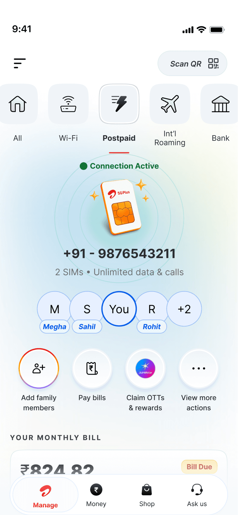
Airtel Thanks serves as a central hub for millions of users to buy new products or track usage, manage plans, and access exclusive benefits of existing ones.


Overview
Business & Challenges
Airtel Thanks serves millions of Wi-Fi, Mobility (Prepaid & Postpaid), DTH and Black customers across India.
Yet, even with strong adoption, the core “Manage” space wasn’t driving self-serve behaviour.
66%
53%
users land on the Manage home every month
~11.2M
never visit their service detail page
of app-active users still call customer care for information already present.
As the Manage space, of service landing pages mixed service information, bills, plan details, rewards and utilities while the answers users needed remained buried. This revealed a fundamental gap between what users needed and what the app enabled.
Re-design Manage to reduce assisted calls and create
a predictable, self-serve experience.
Data deep-dive
IVR & Call Centre Data Analysis
This became the foundation of my discovery research
~7.2M users
chose assisted channels within 7 days of using the app.
Prepaid
DTH
Broadband
Postpaid
66%
14%
11%
9%
2.6 lakh calls/month
5.8 lakh interactions/month
84% - Hindi
12% – Regional Languages
4% – English
3.8 lakh interactions/month
Data usage confusion & Bill clarification
Account health issues (network, validity, DTH errors, outages)
IVR Language Split
Plan change, clarity & comparisons
Research & Usability Testing
50+ depth interviews ·
Behavioural analysis
& journey mapping



+49
To understand why users continue to rely on customer care despite being app-active,
I conducted in-depth interviews with 50+ Airtel Thanks App users across multiple Lines of Business (LOBs).
The research focused on specific cohorts who opened the app, dropped off at key screens, and then contacted customer care for information that was already present in the app.
60%+ prepaid users
100% of users who called customer care
Felt overwhelmed by details and texts and avoided reading long paragraphs, leading to hesitation and fear of taking the wrong action.
Believed the app did not give them the right information at the moment of need—from bill clarification to basic pack details.
Users abandoned the app one step before resolution, then called customer care for clarity or reassurance.
Repeated drop-offs observed
What This Revealed
“The problem wasn’t the absence of information”
It was poor discoverability, language complexity, and lack of contextual guidance at critical moments.
Users opened the app with intent, but left without confidence, defaulting to customer care as the safest and fastest path to resolution.
”
“I want to know what exactly I paid for.”
“Reminder only shows validity — what about due date or low balance?”
“I don’t know if I can see more details of my plan.”
“I get SMS of usage but not real-time updates on the app.”
“I don’t know where my rewards are.”
“What’s included in my pack? I can’t find it.”
“I don’t know what benefits I already have.”
“I need someone to explain my bill.”
“Money is deducted but the app doesn’t show anything — can I trust this?”
“Where can I download my bill PDF?”
“I need a receipt immediately.”
“I want to compare and upgrade my plan but it’s too hidden.”
“How do I recharge for my friend?”
“Where do I buy additional data?”
“I want to upgrade… but I don’t know what’s better for me.”
“Why is my service not working?”
“I can’t see any update on what went wrong.”
“I want to know if there’s an outage before I call someone.”
“I raised a complaint… what next?”
“Talking to a human is easier — I get information faster.”
“I don’t know what feature you offer.”
Plan, Pack & Usage Clarity
Rewards & Offers
Billing, Payments & Receipts
Purchase, Recharge & Upgrades
Account Health & Service Issues
Discovery & Navigation
Understanding the user perspectives
we created the personas to help us move forward with our decision-making.


Goals
Quickly check data balance and pack validity
Recharge at the right time without overpaying
Avoid service disruption

Behaviours
Opens the app to check balance but exits early
Recharges at the last minute
Compares prices across multiple apps for cashback
Calls customer care for reassurance before taking action

Pain Points
Feels overwhelmed by long English paragraphs
Unsure what information to trust when numbers don’t match
Afraid of making a wrong recharge or losing benefits

Needs from the App
Simple, visual pack summaries
Clear recharge triggers (“Recharge now / Safe to wait”)
Hindi-first, conversational language
Confidence-building guidance


The Assurance Seeker
Prepaid user (manages 2–3 family recharges)
“I watch YouTube to study, so tracking my data is important.”
“I call customer care because the app doesn’t always show real-time usage.”
App usage: Opens app frequently, rarely completes journeys
Primary Channel: Customer Care + SMS
Tech Comfort: Medium
Language Preference: Hindi-first
Goals
Manage multiple services independently
Track usage and control costs
Resolve issues without calling support
Behaviours
Remembers plan details and validity
Uses the app to add/remove DTH channels
Calls customer care only for network or mismatch issues
Explores features independently
Pain Points
Important service information is scattered
No single view of account health
Limited visibility into what actions are possible
Needs from the App
Unified service view
Clear service health indicators
Faster access to deep service actions
Predictable, consistent navigation

The Control Manager
Multi-service (Postpaid + Prepaid + DTH)
“The app doesn’t explain my bill clearly when I need it.”
“Calling feels faster than trying to understand the bill in the app.”
App usage: Opens app regularly, purposefully
Primary Channel: App first, Customer Care when stuck
Tech Comfort: High
Language Preference: English + regional
These personas highlighted that anxiety, not complexity, was driving users to customer care.
Heuristic Evaluation
High recall load
I evaluated key Manage screens using Nielsen’s heuristics.
Major violations included:
This helped validate the research insights with UX fundamentals.
Some cards move to highlight the critical action but some remain unchanged, creating confusion
The long list of quick actions makes it harder to find common tasks. Group related actions or prioritize the most-used ones.
Get instant support” is helpful, but support links could be grouped around the relevant balance or service.
Visibility of expired pack is low, which affect service continuity


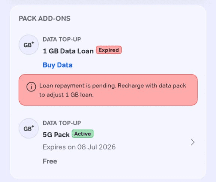
option to get clarity (view more) before making a payment is not available to the user


No change in state or service health with the same next best action
unclear state of service, also there is no action visible, unfamiliar icons


01
Poor visibility of status
Users could not quickly tell if a service was healthy, a pack was expiring or a payment had succeeded.
02
Low user control
Many journeys ended without a useful next-best action or to get more clarity before committing.
03
High recall load
Users had to remember where plan details, bills, receipts, add-ons and service controls lived.
04
Language mismatch
Dense English and technical terms appeared in the exact moments when users were already uncertain.
Synthesising the problem
High recall load
Serve clarity before asking for action.
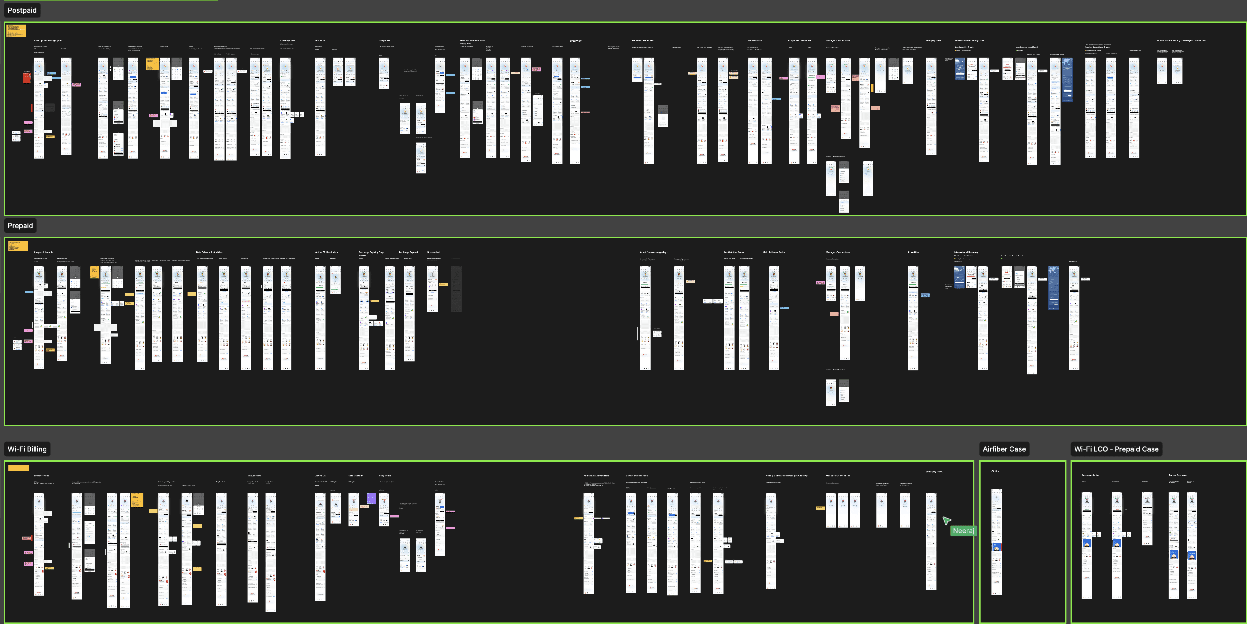
We shifted the experience from a generic Manage dashboard to service-led CLPs: predictable destinations designed around what users most frequently needed to know and do.
What changed
↓ Customer Care Dependency
↑ Self-Serve Success
Service Details were restructured, surfaced earlier, and made scannable
Critical information (plan, usage, validity, bills) moved from hidden paths to direct access
Reduced dependency on listings by introducing focused detail views
Service Details Pages — Proven Impact
11%
reduction in bill clarification related calls
+27%
reduction in account health & service status queries
+18%
increase in users completing tasks without escalation

aanchaling
work
·
process
·
about
·
वगैरह - वगैराह